When it comes to counsellors and psychotherapists, everyone hates stats. Well, almost everyone. Aside from a few geeks like myself who would prefer nothing better than sitting in front of an Excel spreadsheet for days.
…Oh yes: and, then, there’s also the funders, commissioners, and policy-makers who all rely almost exclusively on the statistical analysis of data. And that creates a real tension. Most of us don’t come into therapy to do statistical analysis. We want to engage with people—real people—and studying people and processes by numbers can feel like the most de-humanising, over-generalising kind of reductionism. But, on the other hand, if we want to have an impact on the field and influence policy and practice, then we do need to engage with quantitative, statistical analysis. Or, at least, understand what it is saying and showing. If not, there’s a danger that those therapies that are most humanistic and anti-reductionistic are also those that are most likely to get side-lined in the world of psychological therapy delivery.
And there is also another, less polarised, way of looking at this. From a pluralistic standpoint, no research method—like no approach to therapy—is either wholly ‘right’ or ‘wrong’ (see our recent publication on pluralistic research here). Rather, different methods of research and analysis are helping in asking different questions at different points in time. So if you are asking, for instance, about the average cost of a therapeutic intervention; or whether, on average, a client is more likely to find Therapy A or Therapy B more helpful; then it does make sense to use statistics. (But if you wanted to know, for instance, how different clients experienced Therapy A, then you’d be much better off using qualitative methods).
This blog presents a very basic introduction to terms and concepts in quantitative analysis. This may be helpful if you are wanting to present some basic statistical analyses in a research paper, or if you are reading quantitative research papers and want to get more of a grasp on what they are meaning and doing. You can find many books and guides on the internet that give more in-depth introductions to quantitative analysis, one of the most popular being Andy Field’s Discovering Statistics Using IBM SPSS Statistics.
Quantitative analysis and statistical analysis are essentially the same thing (and will be used synonymously in this blog): the analysis of number-based data. The principle alternative to quantitative analysis is qualitative analysis, which refers to the analysis of language-based data.
Descriptive Statistics
There are two main sorts of quantitative analysis. The first is descriptive statistics. This is where numbers are used to show what a set of data looks like (as opposed to testing particular hypotheses, which we’ll come on to). Descriptive statistics may be used in a Results section to present the findings of a study but, even if you are doing a qualitative study, you may use some descriptive statistics to present some data about your participants. So always worth knowing.
Frequencies
Probably the most basic statistic is just saying how many of something there are: for instance, how many participants you had in a study, or how many of them were BAME/White/etc. There are two basic ways to do this:
Count. ‘There were nine participants in the study; three of them were of a black or minority ethnicity and six were white.’ Count is just the number of something, and about as simple as statistics gets.
Percentage. Percentage is the amount of something you would have if there was 100 in total. It’s a way of standardising counts so that we can compare them. For instance, if we had three BAME participants out of nine total participants in one study; and ten BAME participants out of 1000 total participants in a second study; the count of BAME participants in the second study is higher, but actually they were more representative in the former. We work out percentages by dividing the count we’re interested by the total count, then multiplying by 100. So our percentage in the first study is 3/9 * 100 (‘/’ means ‘divide by’, ‘*’ means ‘multiply by’), which is 33.3%; and in our second study is 10/1000 * 100, which is 1%. 33.3% vs. 1%: that really shows us a meaningful difference in representation across the two studies. Percentages are easy to work out by Excel: just do a formula where you divide the number in the group of interest by the total number, and multiple by 100. Only do percentages when it’s needed though: that is, when it would be hard for the reader to work out the proportion otherwise. With small samples (less than ten or so) you probably don’t need it. If we had, for instance, one White and one BAME participant, it’s a bit patronising to be told that there’s 50% of each!
Averages
One way of pulling together a large set of numerical data is through averages. This is a way of combining lots of bits of data to give some indication of what the data, overall, looks like. There are three main types of averages:
Mean. This is the one that you come across most frequently, and is generally the most accurate representation of the middle point in a set of data. The mean is the mathematical average, and is worked out by adding up all the scores in a set of data and then dividing by the number of data points. For instance, if you had three young people who scores on the YP-CORE measure of psychological distress (which ranges from 0 to 40, with higher scores meaning more distress) were 10, 15, and 18, then we could work out the mean by adding the scores together (which gives us 43) and then dividing by the number of scores (which is 3). So the mean is 43/3 = 14.3. Whenever we have several bits of data along the same scale—for instance ages of participants in a study, or scores of participants on a measure of the alliance—it can be useful to combine it together using the mean. Means are easy to do on Excel using the function AVERAGE. Note, don’t worry about lots and lots of decimal points. Really, for instance, that the mean above is 14.3333333333333333333333333 etc but no-one needs to know that level of detail. It just looks like we are trying to be clever and actually makes it harder for the reader to know what is going on! So normally one decimal point is enough (unless the number is typically less than 1.0, in which case you could give a couple of decimal points).
Median. Sometimes our data might have an usual distribution. Supposing, for instance, that we did a study and our participants ages were 20, 22, 23, 24, and 95. Well, the mean here would be 36.8 years old, but it doesn’t seem to describe our data very well because we have one ‘outlier’ (the 95 year old) who is very different from the other participants. So an alternative kind of average is the median, which is where we line up our values in a consecutive sequence, and then identify the middle. In this instance, we have five values and the middle one is 23 years old. The MEDIAN function on Excel is also very easy to use, and is a useful way of describing our data when there isn’t too much of it or it’s not smoothly spread out. If the mean and median of a set of values are very different, it’s normally helpful to give both—less important if they are virtually the same.
Mode. Let’s be frank, the mode is like the useless youngest sibling of the central tendency family: it doesn’t really tell you much and doesn’t get used very often. The mode is just the most common response. So, for instance, if we had YP-CORE scores of 20, 20, 23, 25, and 40 the mode would be 20 because there are two of those scores and one of every other one. Not much use, huh! But some times it can be quite informative. For instance, it’s an interesting fact that the modal number of sessions attended at many therapy services is 1. So even though the mode and median may be closer to 6 or so sessions, it’s interesting to note that the most common number of sessions attended is much less. MODE can be shown in Excel, but only report it if it adds something meaningful to what you are presenting.
Spread
Say you had a group of people who were aged 20, 30, and 40 years old. Then you had a second group that were aged 29, 30, and 31 years old. If we just gave the mean or the median of the groups, they’d actually be the same: 30 years old. But, clearly, the two sets of data are a bit different, because the first one is more spread out than the second one. So, if we want to understand a dataset as comprehensively as possible, with as few as possible figures, then we also need some indication of spread.
Range. The range is the simplest way of giving an indication of the spread of a dataset, and just means giving the highest and lowest values. So, for instance, with the first dataset above you might say: ‘Mean = 30 years old, range = 20-40 years old’. That can be pretty informative, though for larger datasets the highest and lowest numbers don’t tell us much about what is in the middle.
Standard deviation. The standard deviation, or SD, is an indication of the spread of a dataset. In contrast to the frequencies or central tendencies, it’s not a number that intuitively means much, but it’s essentially the average amount that the values in a dataset vary from the mean. So in the first group above, the standard deviation is 10 years and in the second group it’s 1 year. Essentially, a higher standard deviation means more spread. Pretty much always, if you’re giving a mean you’ll also want to give the standard deviation; so, in a paper, you’ll see something like: ‘Mean = 30 years old (SD = 10)’. Means look pretty naked without an SD. But it’s not easy to work out yourself, and you’ll need to use something like Excel that can calculate it using the function STDEV.
Standard error. This is getting a bit more complicated, and you’re unlikely to need standard error (SE) if you’re just presenting some simple descriptive statistics, but it is worth knowing about because it’s the basis for a lot of subsequent analyses. Let’s say we’re interested in the levels of psychological distress of young people coming in to school counselling, and we use the YP-CORE to measure it. We get an average level of 20.8 and a standard deviation of 6.4 (this is what we actually got in our ETHOS study of school-based counselling). So far so good. But, of course, this is just one sample of young people in counselling, and what we really want to know is what the average levels of distress of all young people coming into counselling is: the population mean (so sample is the group we are studying, and population is everyone as a whole). So how good is our mean of 20.8 at predicting what the population mean might actually be? OK, so here’s a question: if that mean came from a sample of 10,000 young people, or if it came from a sample of five young people, which would give the most accurate indicator of the population mean (all other things being equal)? Answer (I hope you got this), from the sample of 10,000 people. Why? Because in the sample of five young people, any individual idiosyncrasies could really influence the mean; whereas in a much larger sample these are likely to get ironed out. So the standard error is an indication of how much the sample mean is likely to vary from the true population mean, and it’s worked out by dividing the standard deviation by the sample size (square-rooted). Don’t worry about why it’s the square root (the number that, when multiplied by itself, gives that value—for instance the square root of nine is three). But it just means that the larger a sample, the smaller the standard error gets: indicating that it varies around the true population mean by a smaller amount. Phew!
Confidence intervals. Again, the standard error, as a statistic, isn’t a number that intuitively means much. One thing that is often done with it, however, is to work out the confidence intervals around a particular mean. The confidence interval is our guestimate of where the true population mean is likely to lie, given our sample mean. And it’s always at a particular level of confidence, normally 95% (or sometimes 99%). So if you see something like ‘Mean YP-CORE score = 20.8, 95%CI = 19.5 - 22.1)’ it’s telling us that we can be 95% certain that the true population mean for YP-CORE scores of young people coming into counselling is between 19.5 and 22.1. Pretty cool, and confidence intervals are used more and more these days, because there’s a move from pretending we know precisely what a population mean is to being more cautious in suggesting whereabouts it might lie. Confidence intervals aren’t too difficult to calculate—for 95% CIs, you add, and take away, 1.96 * the standard error—but, like standard errors, there’s no automatic way of doing it on Excel: you need to set up the formula yourself. Or use more sophisticated statistical analysis software like IBM SPSS. Why 1.96? There’s a very good reason, but for that you need to look at one of the more in-depth introductions to stats.
effect sizes
Effect sizes are a really good statistic to know about when you are reading research papers, because they are one of the most commonly reported statistics these days. Also, if you are wanting to compare anything statistically—for instance, whether boys or girls have higher levels of distress when they come into counselling—you’ll want to be giving an effect size.
In fact, there are hundreds and hundreds of different effect size statistics. An effect size is just an indicator of the magnitude of a relationship between two variables. So that might be gender and levels of psychological distress, or it might be the relationship between the number of sessions of art therapy and subsequent ratings of satisfaction. Whatever effect size statistics is used, though, the higher it is the stronger the relationship between two variables.
Cohen’s d. The most common form of effect size that you see in the therapy research literature is Cohen’s d, or some variant of it (for instance, ‘Hedges’s g’ or the ‘standardised mean difference’). This is used to indicate the difference between two groups on some variable. For instance, we could use it to indicate the amount of difference in levels of psychological distress for boys and girls coming into counselling, or to indicate how much difference counselling made to young people’s levels of psychological distress as compared with care as usual (which is what we did in our ETHOS study). Cohen’s d is basically the amount of difference between two scores divided by their standard deviations. So, for instance, if boys had a mean level of distress on the YP-CORE of 20, and girls had a mean of 22, and the standard deviation across the two groups was 4.0, then we would have an effect size of 0.5. (This is the difference between 22 and 20 (i.e., 2 points) divided by 4.0). Dividing the raw difference in scores by the standard deviation is important because if, for instance, boys’ and girls’ scores varied very markedly already (i.e., a larger standard deviation), then a difference of 2 points between the two groups would be less meaningful than if the differences in scores were otherwise very small. Typically, when we interpret effect sizes like Cohen’s d:
0.2 = a small effect
0.5 = a medium effect
0.8 = a large effect
So we could say that there is a medium difference between girls and boys when coming into counselling. In our study of humanistic counselling schools, we found an effect size of 0.25 on YP-CORE scores after 12-weeks between the young people who had counselling and those who didn’t, suggesting that the counselling had a small effect. We can also put a confidence interval around that effect size, for instance ours was 0.03 to 0.47, indicating that we were 95% confident that the true effect of our intervention on young people would lie somewhere between those two figures.
correlational analyses
Correlations are, actually, another form of effect size. But they specifically tell us about the size of relationship between linear variables (i.e., where the scores vary along a numerical scale, like age or YP-CORE scores) rather than between a linear variable and categorical variable (i.e., where there are different types of things, like White vs. BAME, or counselling vs. no counselling).
Correlations. These are used to indicate the magnitude of relationship between just two linear variables. It’s a number that ranges from -1 to 0 to +1. A negative correlation indicates that, as one number goes up the other goes down. So, for instance, a correlation of -.8 between age and levels of psychological distress would indicate that, as children get older, their levels of distress go down. A correlation of 0 would indicate that these two variables weren’t related in any way. A positive number would indicate that, as children get older, so they are more distressed. Correlations can be easily calculated on Excel using the function CORREL. Typically, in interpreting correlations
0.1 = a small association
0.3 = a medium association
0.5 = a large association
Tables
If you’ve got lots of different bits of quantitative data (say six or more means/SDs), it’s generally good to present it in a table. Below, for instance, is a table that we used to present data from our ETHOS study about young people who had school-based humanistic counselling plus pastoral care as usual (SBHC plus PCAU group) and those who had pastoral care as usual alone (PCAU group).
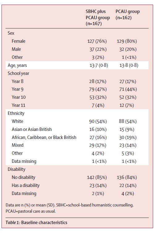
In our text, we also gave a narrative account of the main details here (for instance, how many females and males) but the table allowed us to present a lot of detail that we didn’t need to talk the reader through. Generally, tables are a better way of presenting the data than figures, such as graphs, because they can more precisely convey the information to a reader (for instance, a reader won’t know the decimal points from a graph). Just to add, if you are doing a table of participant demographics, the format above is a pretty good way to do it, with different characteristics listed in the left hand column, grouped under subheadings (like ‘Disability’). That works even when there’s just one group, and is generally better than trying to do different characteristics across the top.
Graphs
…But graphs do look prettier, and sometimes they can communicate key relationships between variables that a table or narrative might not. For instance, below is a graph showing our ETHOS results that gives a pretty clear picture of how our two groups changed on our key outcome measure of psychological distress over time. This gives a very immediate representation of what our findings were, and can be particularly useful when conveying results to a lay audience. However, for an academic audience, graphs can be relatively imprecise: if you wanted to know the exact scores, you’d need to get a ruler out! So use graphs sparingly in your own reports and only when they really convey something that can’t be said in a table. And I’d generally say NAAPC (nearly always avoid pie charts): you can get some lovely colours in them, but they take up lots of space and don’t tend to communicate that much information.
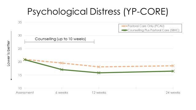
Main outcomes from the ETHOS study
Inferential Statistics
Basic principles
So now we come on to the second main type of quantitative analysis: inferential statistics. This is where we use numbers to test hypotheses: that is, we’re not just describing the data here but trying to test particular beliefs and assumptions. Inferential statistics are notoriously difficult to get your head around, so let’s start by taking a step back and thinking about the problem that they’re trying to solve.
Let’s say we find that, after 10 weeks of dramatherapy, older adults have a mean score of 15 on the PHQ-9 measure of depression, while those who didn’t participate in dramatherapy have a mean score of 16. Higher scores on the PHQ-9 mean more depression, but is this difference really meaningful? What, for instance, if those who had dramatherapy had mean scores of 15.9, as opposed to 16.0 for those without—what would we make of that? The problem is, there’s always going to be some random variations between groups—for instance, one might start off with more depressed people—so any small differences between outcomes might be due to that. So how can we say, for instance, whether a difference of 0.1 points between groups is meaningful, or a difference of 1 point, or a difference of 10 points? What we’re asking here, essentially, is whether the differences we have found between our samples are just a result of random variations, or whether they reflect real differences in the population means. That is, in the real world, overall, does dramatherapy actually bring about more reductions in depression for older adults?
So here’s what we can do, and it’s a pretty brilliant—albeit somewhat quirky, on first hearing—solution to this problem. Let’s take our difference of 1 point on the PHQ-9 between our dramatherapy and our no dramatherapy groups. Now, we can never say, for sure, whether this 1 point difference does reflect a real population difference/effect, because there’s always the possibility that our results are due to random variations in sampling. But what we can do is to work out the probability that the difference we have found is simply due to random variations in sampling. The way we do this is by saying, ‘If there were no real differences between the two groups (the null hypothesis), how likely is it that we would have got this result?’ For instance, ‘If dramatherapy was not effective at all, how likely is it that we would have got a 1 point difference between the two groups?’ We can work that out basically by looking at the ratio between how much scores tend to vary anyway across people (i.e., the standard deviation), and then how much they vary between the two specific groups. For instance, if we find lots of differences in how older adults score on the PHQ-9 after therapy, and only very small differences between those who had, and did not have, dramatherapy, the likelihood that the mean differences between the two groups would be due to just random variations would be fairly high. The exact method to calculate this ratio is beyond this blog (and Excel too—you generally need proper statistical software), but the key figure that comes out of it all is a probability value, or p-value. So this is a number, from 1.0 downwards, which tells you how likely it is that your results are just due to chance. So you might get a p-value of .27 (which means that there is a 27% likelihood that your results were due to chance) or .001 (which means that there is a 0.1%, one-in-a-thousand, likelihood that it was due to chance).
So what do you do with that? Well, the standard procedure is to set a cut off point and to say that, if our probability-value is less than that, we’ll say that our difference is significant. That cut-off point is typically .05 (i.e., 1-in-20), and sometimes .01 (i.e., 1-in-100). So, essentially, what we do is to see whether the probability of our results coming about by random is 1-in-20 or less and, if it is, we say that we have a significant result. Why 1-in-20? Well, that’s a bit random in itself, but it’s an established norm, and pretty much any paper you see will use that cut off point to assess whether the likelihood is so low that we’re going to say we’ve found a meaningful difference. Note, if we don’t find a p-value of less than 1-in-20 we can’t say that we’ve shown two things are the same. For instance, if our p-value for dramatherapy against no dramatherapy was 0.27, it doesn’t prove that dramatherapy is no more effective than no dramatherapy. It just means that, at this point, we can’t claim that we have found a significant difference.
Statistical tests
There are a large number of statistical tests that you’ll see in the literature, all based on the principles outlined above. That is, they all ways of looking at different sets of data and asking the question, ‘How likely is it that these results came about by chance?’ If it’s less than 1-in-20, then the null hypothesis that the results are just due to random variations is rejected, and a significant finding is claimed. That’s what researchers are looking for; and it’s a bit weird because, as you can see, what we’re trying to do is to disprove something we never really believed in in the first place! It’s all based, though, around the principle that you can only ever disprove things, not prove things—see Karl Popper’s work on falsifiability here.
Some of the most common families of statistical tests you will come across are:
T-tests. These are the most simple tests, and compare the means of two groups. This may be ‘between-participants’ (for instance, PHQ-9 scores for people who have dramatherapy, and those who do not have therapy) or ‘within-participants’ (for instance, PHQ-9 scores for people at the start of dramatherapy, and then at the end).
Analysis of variance (ANOVAs). These are a family of tests that compare scores across two or more different groups. For instance, the PHQ-9 scores of participants in dramatherapy, counselling, and acupuncture could be compared against each other. Multiple analyses of variance allows you to compare scores on different dimensions, and then also the interactions between the different dimensions. For instance, an experimental study might look at the outcomes of these three different interventions, and then also compare short term and long term formats. Repeated measures analyses of variance combine within- and between-participant analyses: comparing, for instance, changes on the PHQ-9 from start of therapy to end of therapy for clients in dramatherapy, as compared with one or more other interventions.
Correlational tests. Correlations (see above), like differences in means, are very rarely exactly 0, so how do we know if they are meaningful or not? Again, we can use statistical testing to generate a p-value, indicating how likely the association we find is due to random chance.
Regression analysis. Regression analysis is an extension of correlational testing. It is a way of looking at the relationship between one linear variable (for instance, psychological distress) and a whole host of other linear variables at the same time (for instance, age, income level, psychological mindedness). Categorical variables, like gender or ethnicity, can also be entered into regression analyses by converting them into linear variables (for instance, White becomes a 1 for ‘yes’, and a 0 for ‘no’). So regression analyses allow you to look at the effects of lots of different factors all at once, and to work out which ones are actually predictive of the outcome and which are not. For instance, correlational tests may show that both age and ethnicity are associated with higher levels of distress, but a regression analysis might indicate that, in fact, age effects are cancelled out once ethnicity is accounted for.
Chi-squared tests. As we’ve seen, some data, like gender or diagnoses, is primarily categorical: meaning that it exists in different types/clumps, rather than along continua. So if we’re asking a question like, ‘Are there differences in the extent to which boys and girls are diagnosed with ADHD vs depression?’, we can’t use standard linear-based tests, because there’s no outcome variable. Instead, we use something called a chi-squared test, which is specifically aimed at looking at differences across frequency counts.
… And that’s just the beginning. There’s a mind-boggling number of further tests, like structural equation modelling, cross-panel lag analysis, multilevel modelling, and a whole family of non-parametric tests, but hopefully that gives you a rough idea. There all different procedures, but they’re all based around the same principle: How likely is it, given the results that you got, that there is no difference between the groups? If that likelihood is less than 1-in-20, we’re going to say that something ‘significant’ is going on.
Final thoughts
Whether you like stats or not, they’re there in the research, so if you want to know something of what the research says, you do need to have a basic understanding of them. But we don’t need to get into either/or about it. Stats have their strengths and they have their limitations: from a pluralistic standpoint, they tell one (very helpful at times) story, but it’s not the only story that tells us what’s going on.
Stats, to some extent at least, is also changing. When I trained as a psychology undergraduate in the 1980s, for instance, it was all about significant testing. Today, particularly in psychotherapy research, there’s more emphasis on using stats descriptively, in particular effect sizes and confidence intervals. That’s through a recognition that the kind of yes/no answers you get from inferential tests are too binary and too unrepresentative of the real world.
If you’re staring blankly at this blog and thinking, ‘What the hell was that about?’ do let me know in the comments what wasn’t clear and I’ll try and explain it better. I do, I guess, wish the therapy world would love stats a bit more. I guess that’s partly because it’s so important for understanding what’s getting commissioned and funded and making a difference there; but maybe more because I can see, for myself, so much beauty in it. And that doesn’t in any way take away from the beauty of words or language or art or the many, many other ways of knowing. But numbers can also have a very special place there in helping us to understand people and therapy more; and once you’ve got a basic grasp of what they are trying to do, hopefully they’ll feel more like friend than foe.
Acknowledgements
Photo by Mick Haupt on Unsplash
Disclaimer
The information, materials, opinions or other content (collectively Content) contained in this blog have been prepared for general information purposes. Whilst I’ve endeavoured to ensure the Content is current and accurate, the Content in this blog is not intended to constitute professional advice and should not be relied on or treated as a substitute for specific advice relevant to particular circumstances. That means that I am not responsible for, nor will be liable for any losses incurred as a result of anyone relying on the Content contained in this blog, on this website, or any external internet sites referenced in or linked in this blog.